-
 Blog
Blog
-
 Where did the Code-Perspective Go? (Adapting a UI ...
As a software project evolves, it is often necessary to adapt parts of its user interface (UI) accordingly. However, this can be tricky as users might suddenly feel unfamiliar with your product. In our Teamscale 3.2 release, we revamped Teamscale’s »Code« perspective, which is now called »Metrics«. This post explains why we introduced these changes and, in addition, provides some guidance if you are an existing Teamscale user.
Teamscale’s »Code« Perspective
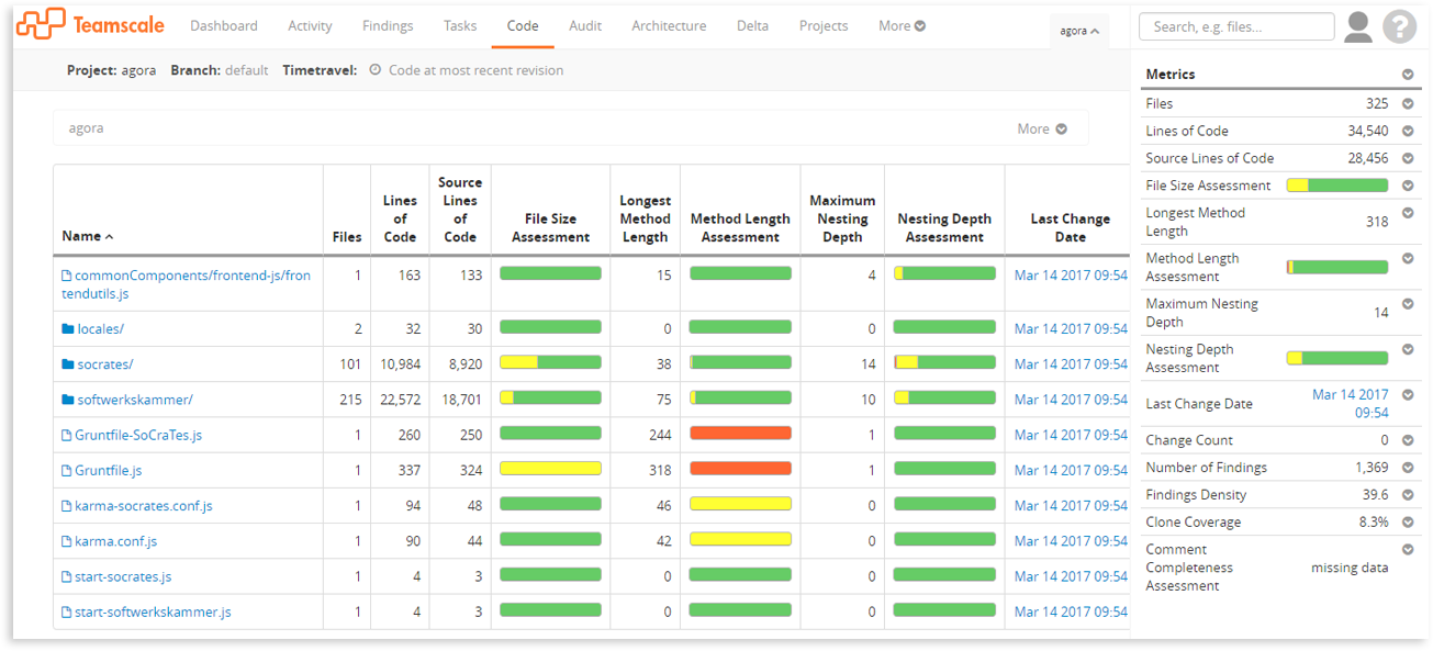
As the name suggests, the Code perspective in Teamscale offers a view on your source code. You can navigate to subfolders and individual files just like in the file manager of your operating system. The main difference, of course, is that with Teamscale, you get a quick overview of code metrics for your system, e.g. the amount of code duplication (»clone coverage«) of each folder and file.

You might be asking: Why did we need to change this at all? The answer is two-fold:
-
On the one hand, as the number of Teamscale’s features was (and is) growing constantly, and we obviously want to make these features accessible for our users. Good examples are customizable non-code metrics that can be uploaded to Teamscale, or custom threshold profiles, which basically allow you to tell Teamscale how to assess certain metric values.
-
On the other hand, the existing UI could quickly feel overloaded, especially for large repositories and big screen sizes. The high number of table columns and, additionally, the content of the sidebar could lead to a cognitive overload that prevents users from finding the information they are looking for.
In the course of the redesign of the perspective, we strived to take both of these points into consideration.
The new »Metrics« Perspective
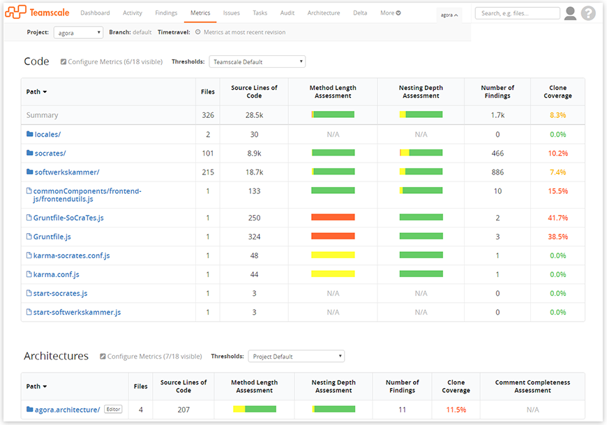
As you know, a picture is worth a thousand words, so let’s take a look:

Here are a couple of things we want to point out:
- The sidebar is gone – but its content is still there! Instead of having a separate table that shows metric summaries in the sidebar, the first row of the table(s) now presents this information in a much more elegant way.
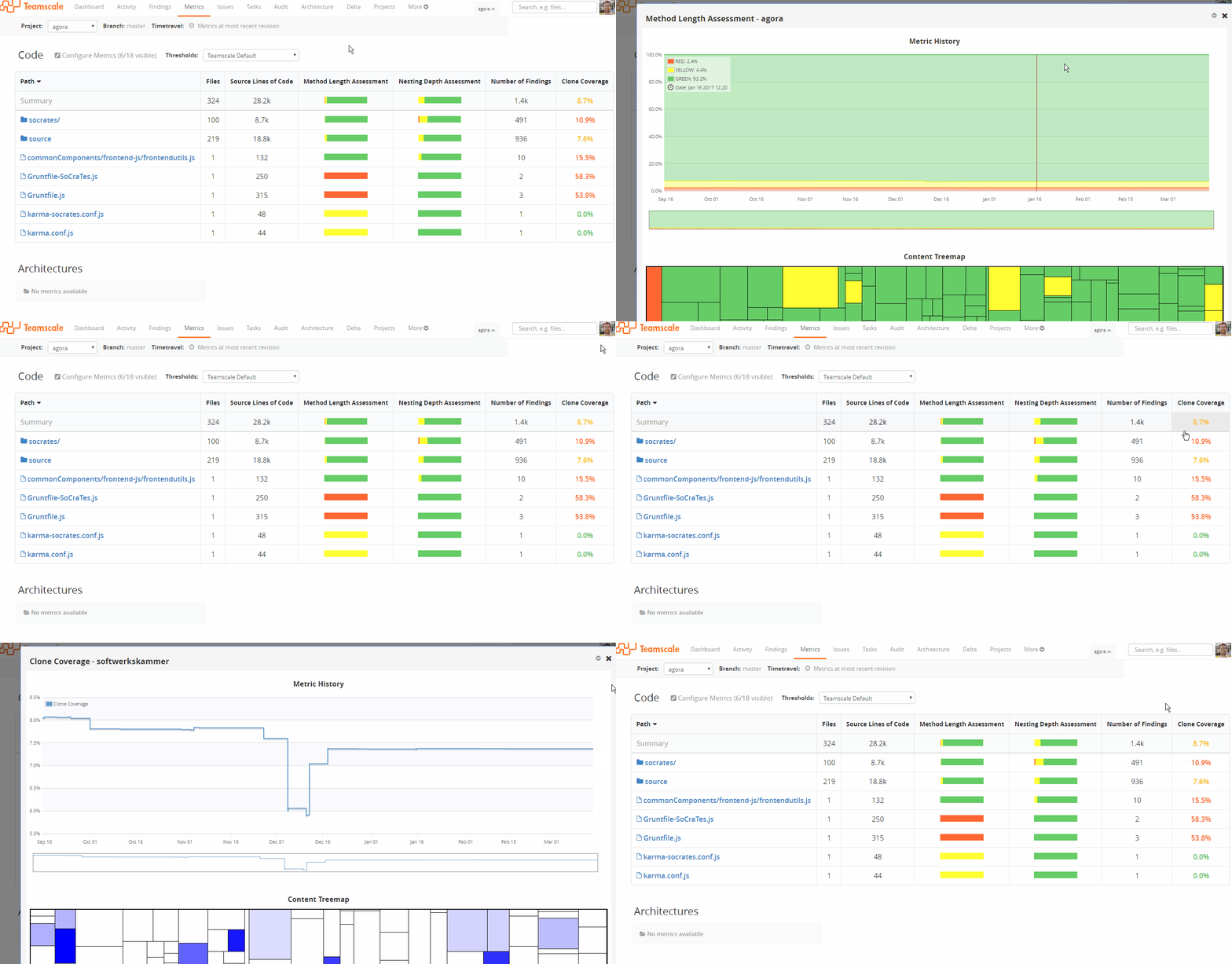
»But without the sidebar, where do I find the metric history or the treemap now?«, you might ask. Simply click on a table cell that is interesting to you (including the summary row, of course). And, best of all, this is now possible for all (suitable) metrics/paths and is not limited to the current directory. So to summarize, even though we removed the sidebar, you can actually do more now:

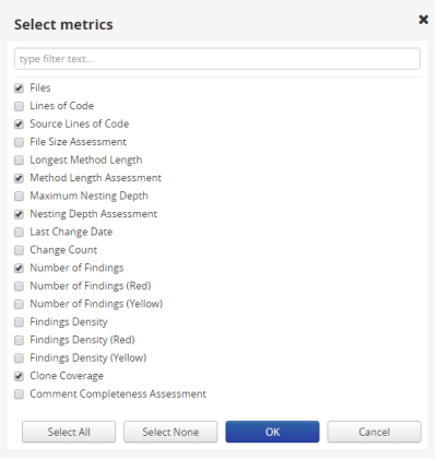
- Not all metrics are shown as default. Instead, we only display the values for eight central metrics – number of files, source lines of code (SLOC), clone coverage, total number of findings, the assessments for comment completeness, method length, and nesting depth, as well as the line coverage (if configured, for example by using JaCoCo results). But of course, you can configure Teamscale to show exactly the metrics you are interested in. A click on the »Configure Metrics« above each table will let you choose which metrics should be visible in the corresponding table:

-
Threshold Profiles Above each table, there is now a dropdown that lets you select a so-called threshold profile. Such profiles enable you to define certain values (i.e., the thresholds) that tell Teamscale how to assess metrics. You can learn about this feature in this post by my colleague Rainer Niedermayr. Note that you can also simply rely on Teamscale’s default profile. Using the selected threshold profile, the text color now reflects how »good« (or »bad«) a particular metric value is (e.g. see column »Clone Coverage« in the screenshot).
-
Architecture & Non-Code Metrics The new perspective shows up to three tables. All of them let you navigate into subsequent directories, but their scope varies: The Code table includes all files & folders of your repository, the Architecture table only considers architecture components, and the Non-Code section gives an overview of external metrics that have been uploaded to Teamscale. Note that the latter will be hidden if no non-code metrics have been uploaded yet.
-
A new name Instead of »Code«, the perspective label now says »Metrics«. This is because this perspective can also show customizable non-code metrics, so we needed to adapt the name accordingly.
Behind the scenes
As you might have noticed, this perspective looks different (and dare we say: better!) than before and compared to many of the remaining perspectives. This is especially visible if you compare the general style of the tables. For the redesign, we took advantage of the Semantic UI framework that helped us to incorporate a clean, modern design language. Of course, we are planning to refresh other parts of the UI in future Teamscale releases as well.
In addition, we took the redesign as an opportunity to change some parts of the backend code, which should result in performance improvements (and made our lives easier). This also allowed us to refactor parts of the JavaScript code, which was a pleasant side effect.
Lessons learned
Personally, I think there are two main takeaways here:
-
With the ever-growing number of features in your software, it can be helpful to take a step back and question (UI-related) decisions made in the past: »Did our UI evolve at the same pace, or do we need to rethink something?«
-
Cleaning up your UI does not inherently make features less accessible to your users. Moving (most of) the content of the former sidebar into a single additional table row is a good example for this point.
All in all, we are pretty happy with our changes and Teamscale’s new look. But of course, the real question is: Do you like it? Feel free to leave a comment or contact us directly for any questions or problems.
Related Posts
Our latest related blog posts.
